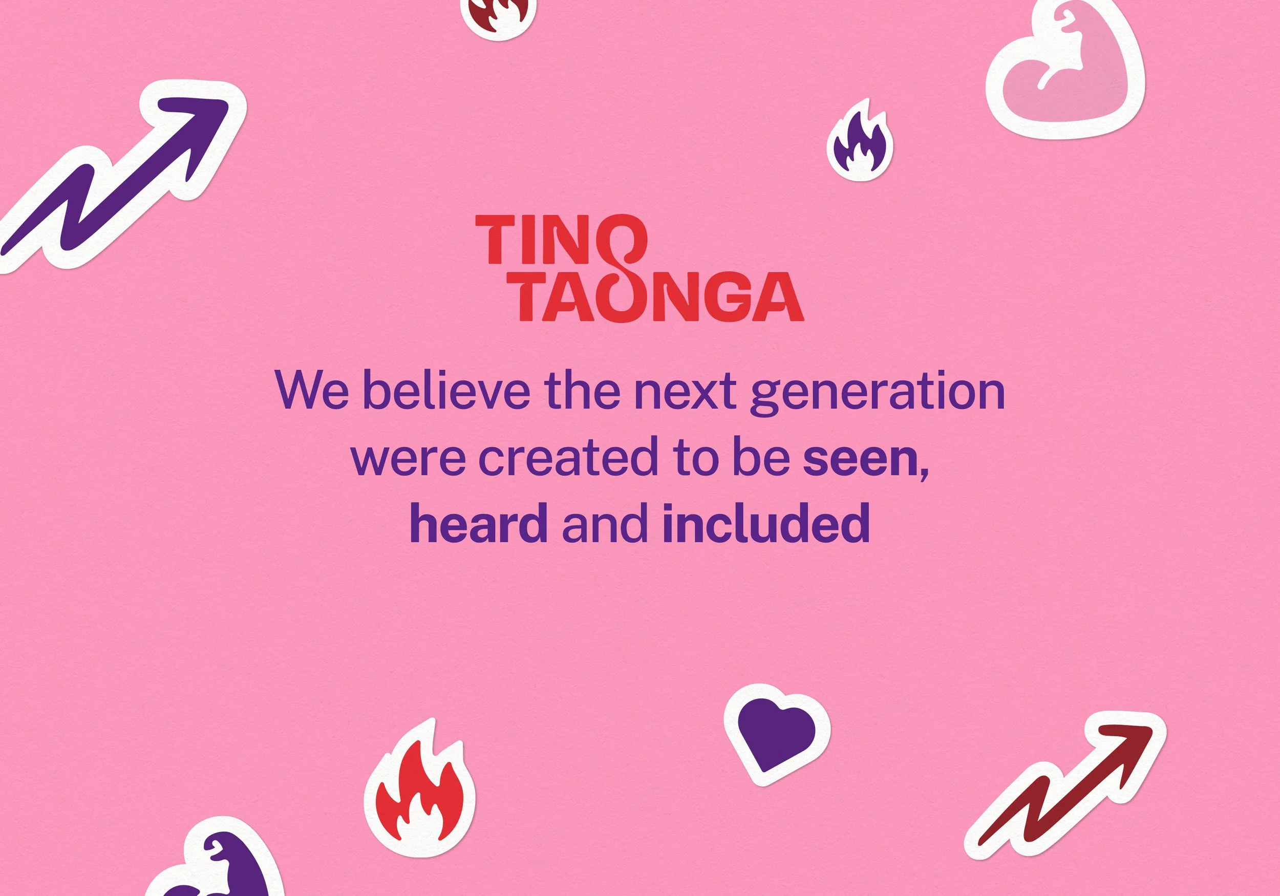
Tino Taonga
A call to recognise tamariki and rangatahi as our greatest treasure throughout The Salvation Army.
Created in collaboration with Māia meant the communications strategy, naming, tone of voice, and brand identity were all crafted together in tandem.
SECTOR: NON-PROFIT / SOCIAL GOOD
SERVICES DELIVERED: BRAND IDENTITY, LOGO DESIGN, ART DIRECTION, BRAND GUIDELINES, COLLATERAL, APPAREL
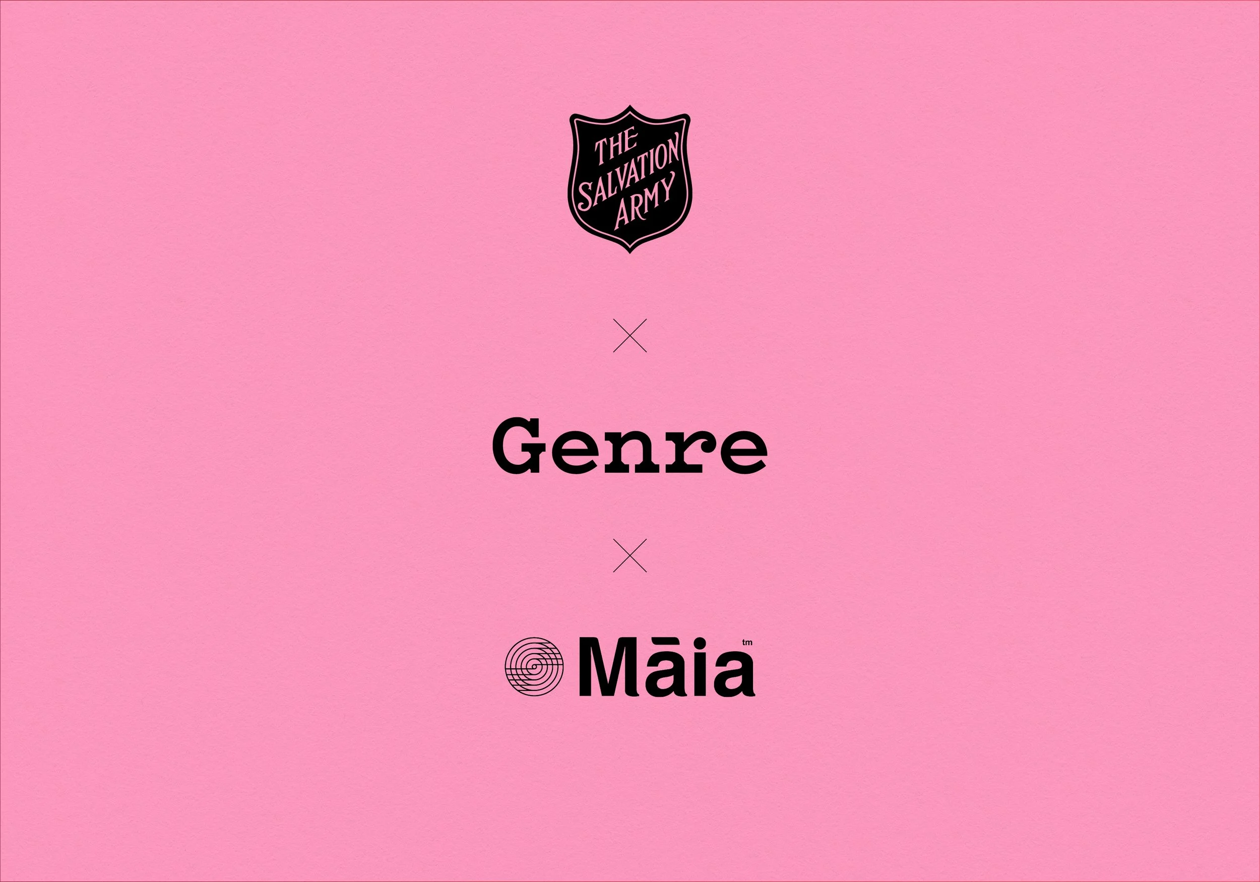
Collaborating with Māia – who led the communications strategy and naming – meant that The Salvation Army were also part of the journey at every stage, leading to a cohesive identity.
Māia, a kaupapa-driven communications studio also ensured that quality research and te ao Māori insights were at the heart of the process.
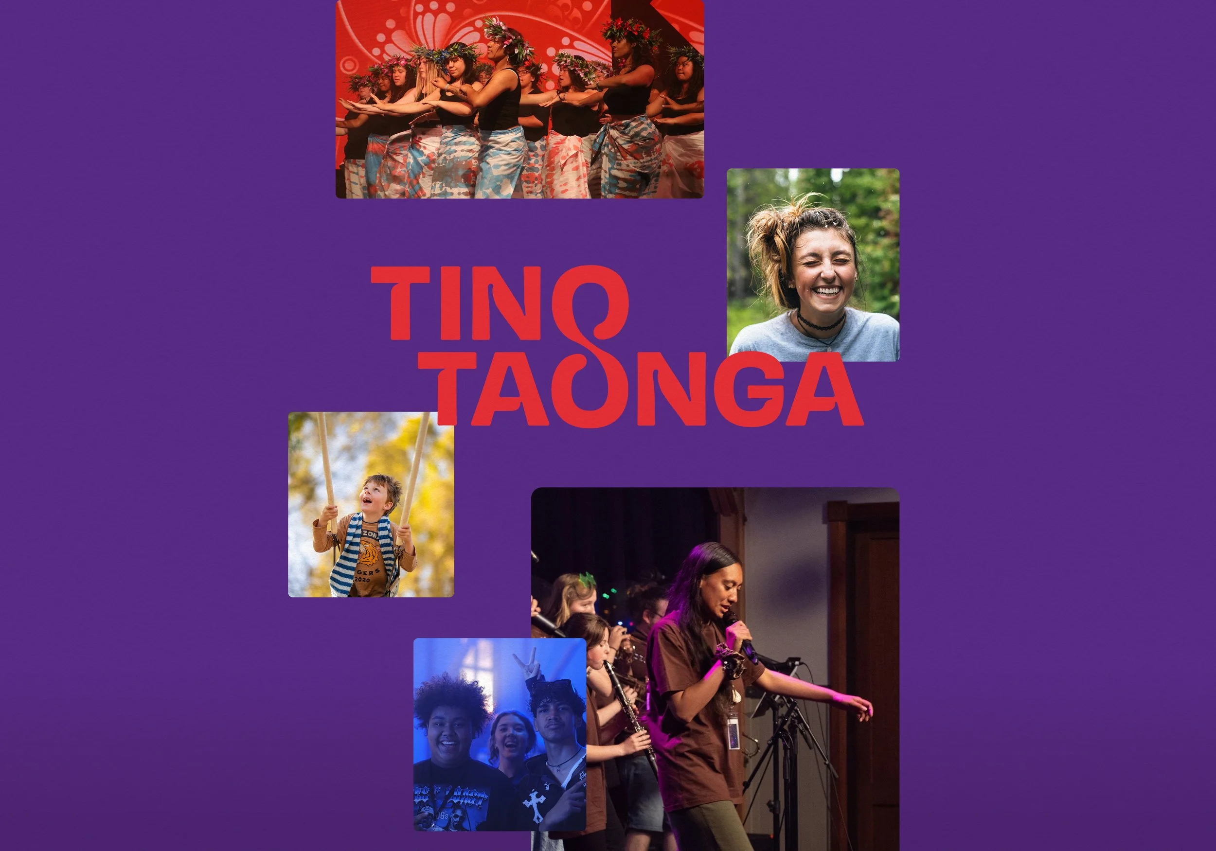
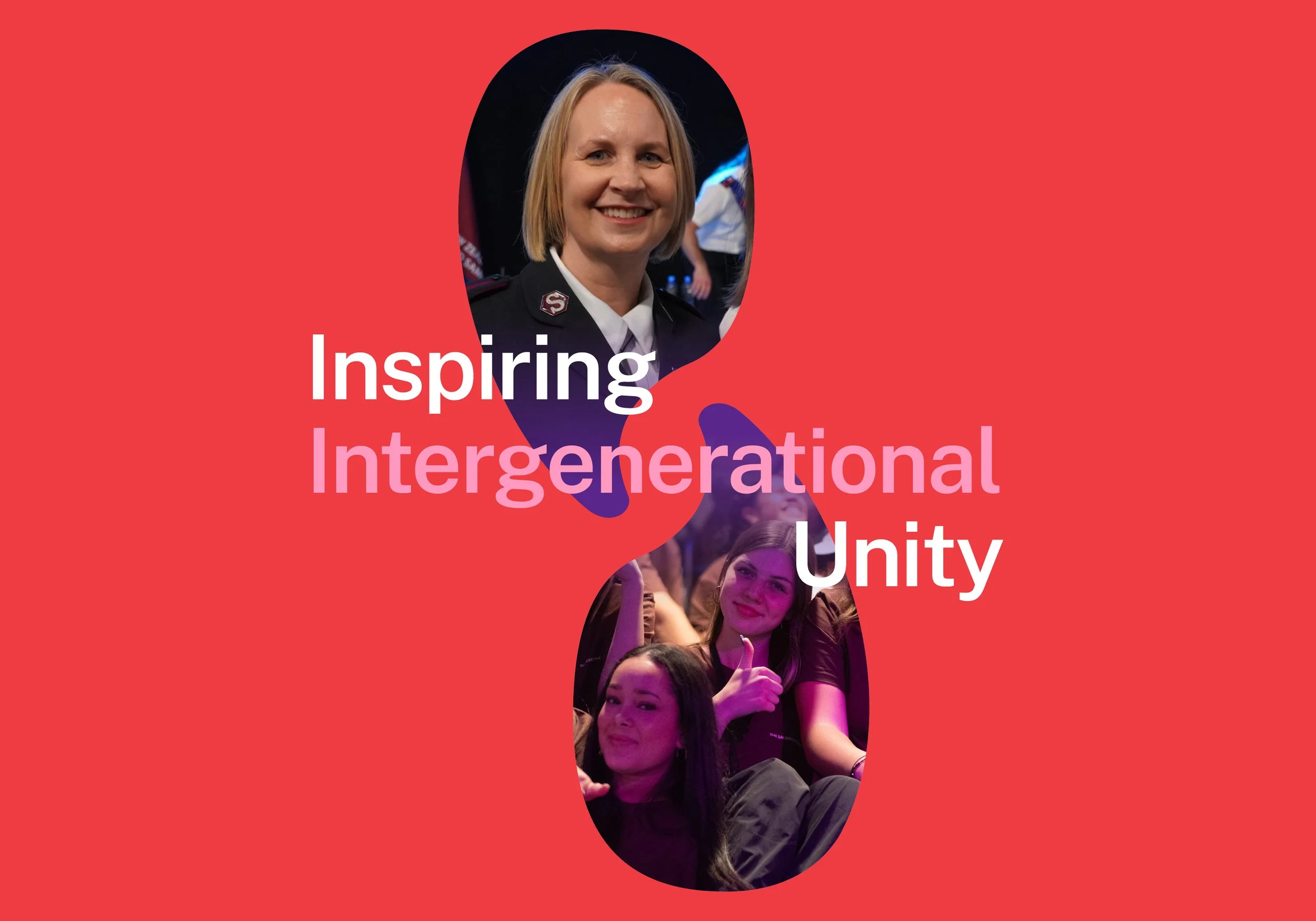
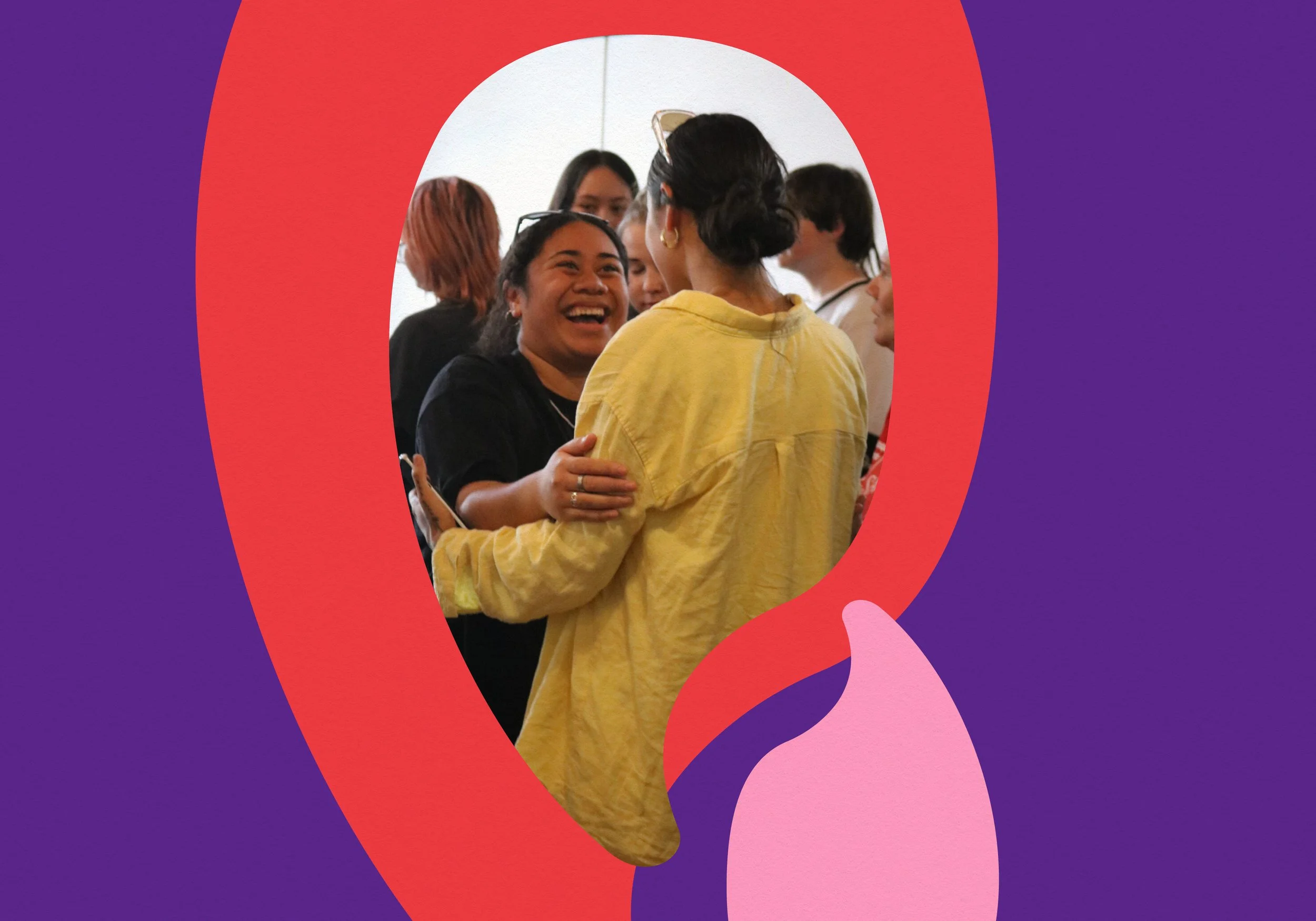
The visual styling weaves the pikorua into the logotype to symbolise togetherness and intergenerational unity with a youthful aesthetic.
Our greatest treasure
At the heart of Māia’s communications strategy was a simple but powerful truth: young people, tamariki and rangatahi, are a treasure. The name Tino Taonga gives that idea a voice, celebrating young people as truly invaluable.


Speaking your language
To genuinely connect with young people across Aotearoa, Fiji, Tonga, and Samoa, The Salvation Army ensured the brand sentiment was expressed in every language – also including Hindi.
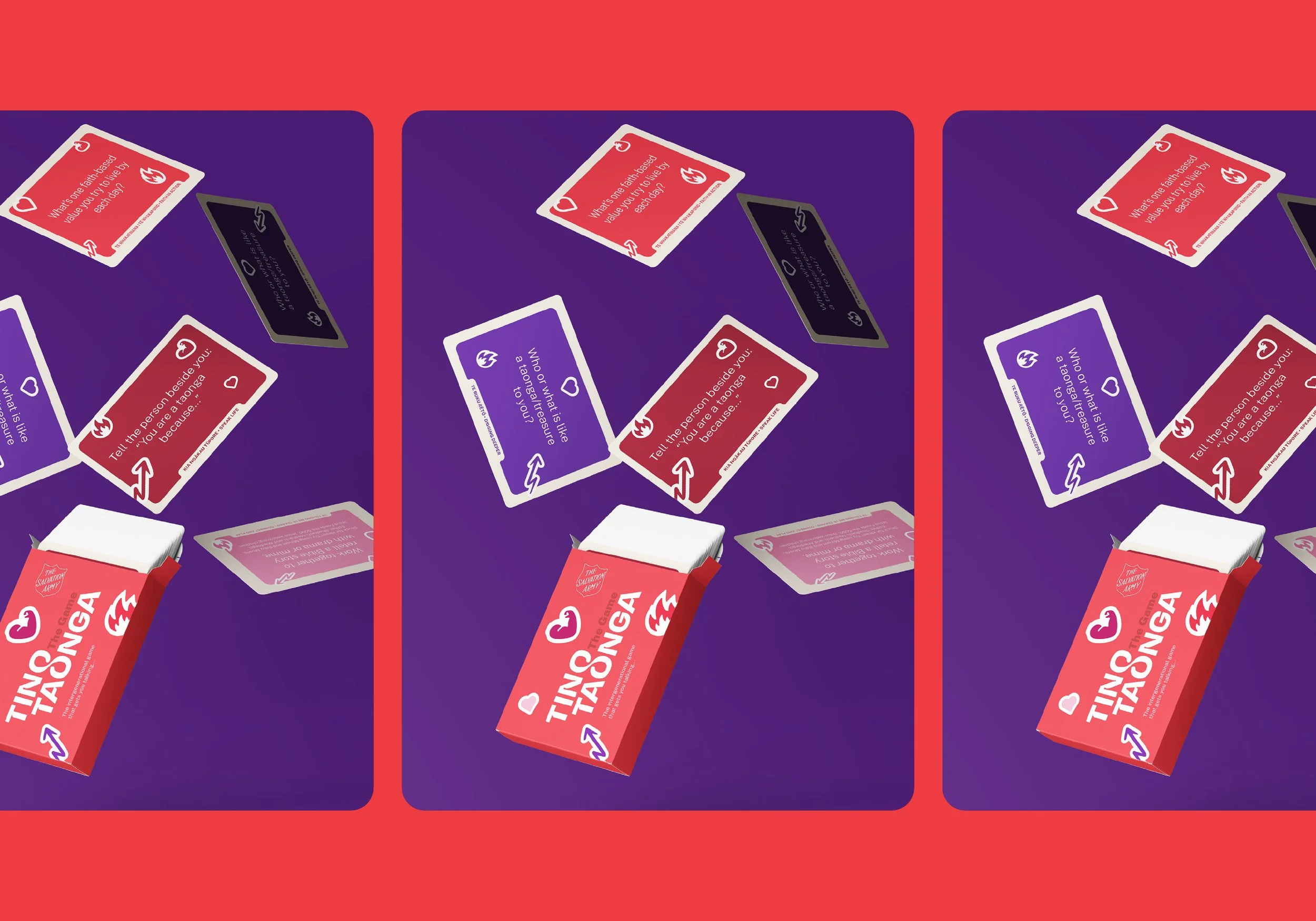
A playful connection
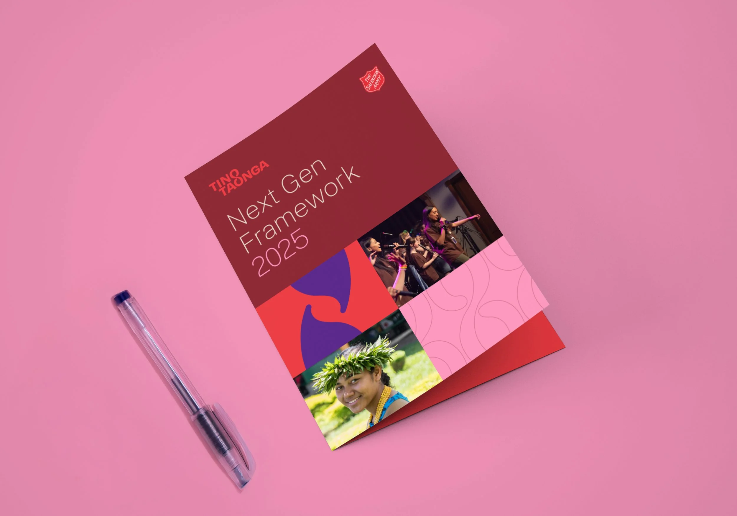
Tino Taonga encourages all generations to treasure young people. An interactive card game brought this to life, creating a playful way to inspire conversation and shared discovery.