
Aotearoa Society of Adaptation Professionals
A progressive brand identity for a leading Aotearoa environmental non-profit collective.
Genre created a distinct brand identity – purposefully designed to communicate unity in the face of our urgent climate crisis.
SECTOR: ENVIRONMENTAL IMPACT / NON-PROFIT
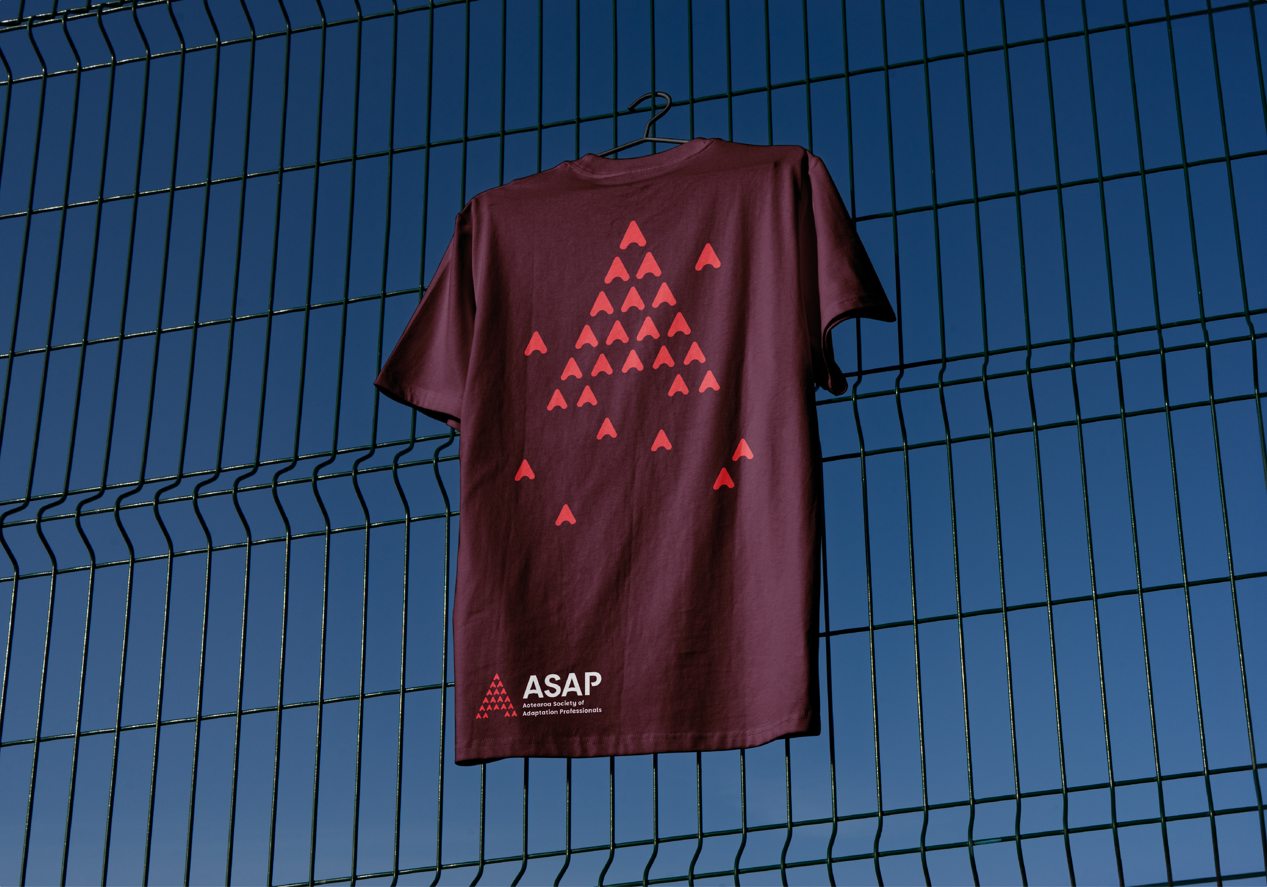
SERVICES DELIVERED: BRAND IDENTITY, LOGO DESIGN, ART DIRECTION, BRAND GUIDELINES, COLLATERAL, APPAREL
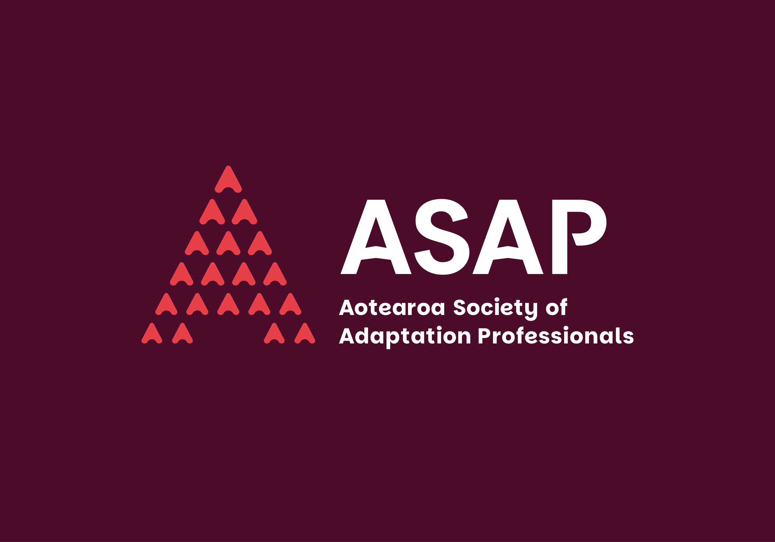
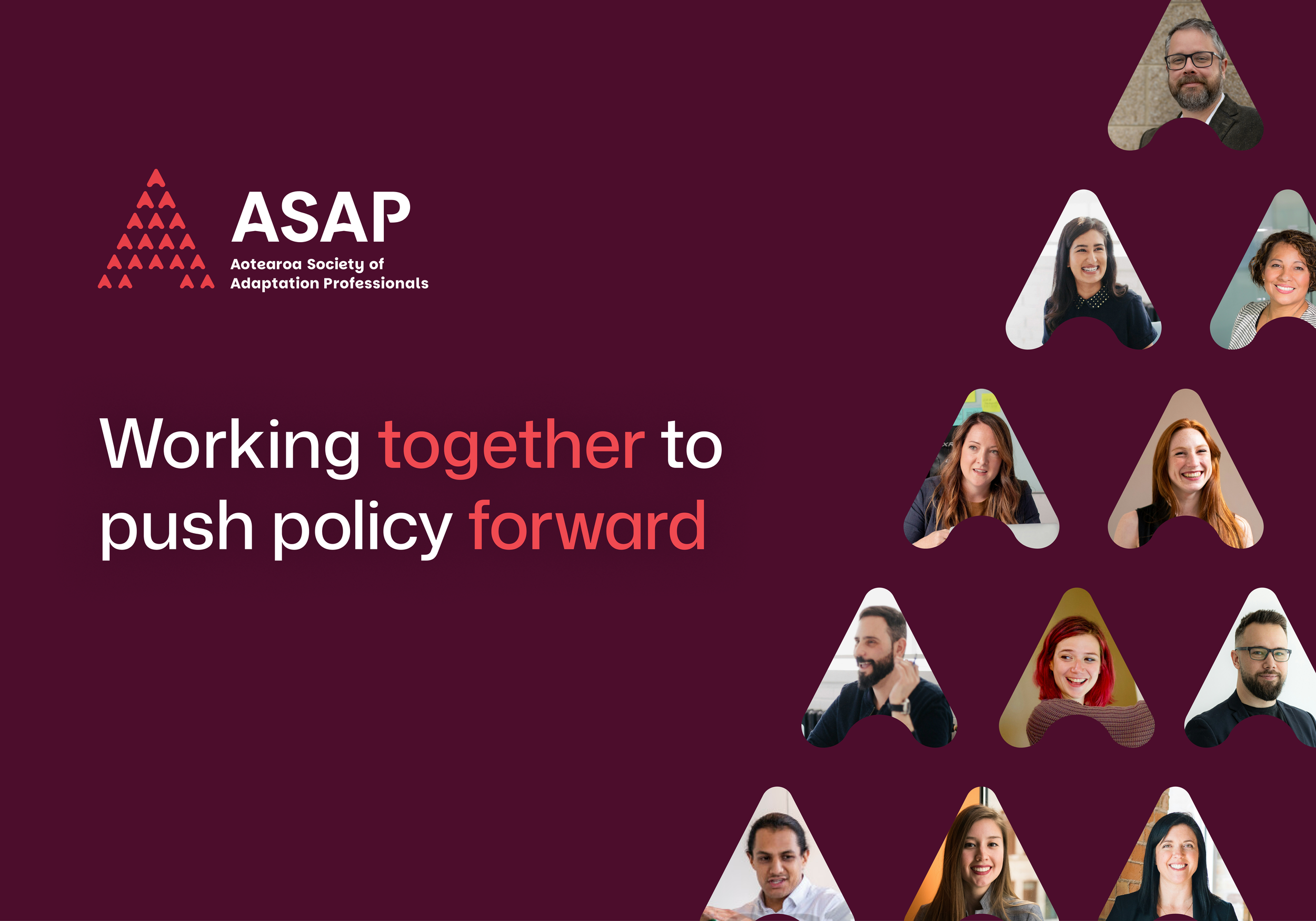
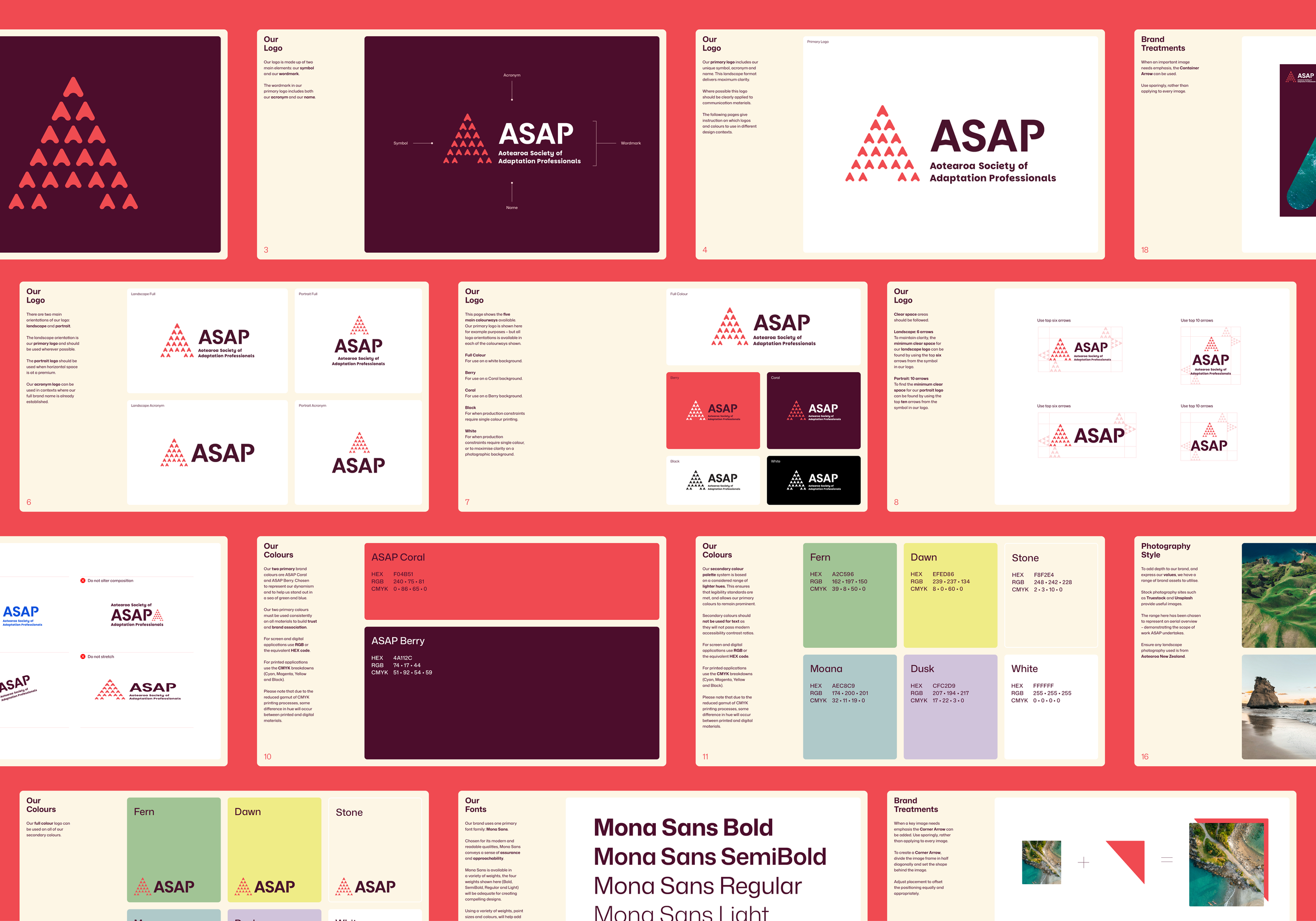
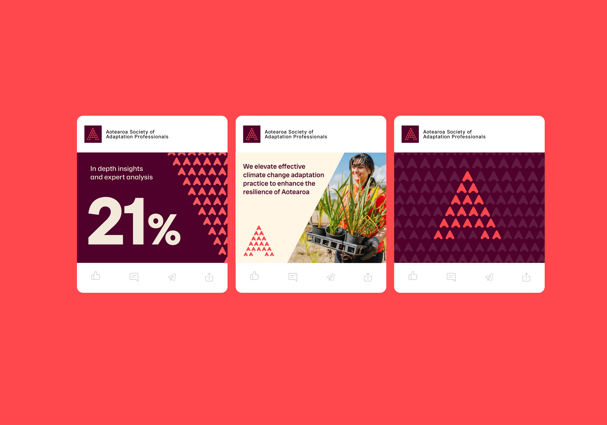
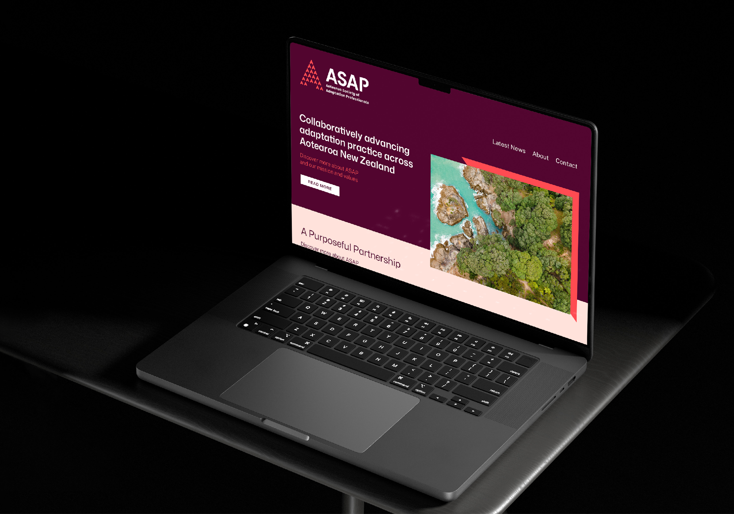
ASAP is the leading network for adaptation advancement in Aotearoa. They are a dynamic and determined collective – working together, pushing in the same direction to move policy forward effectively.
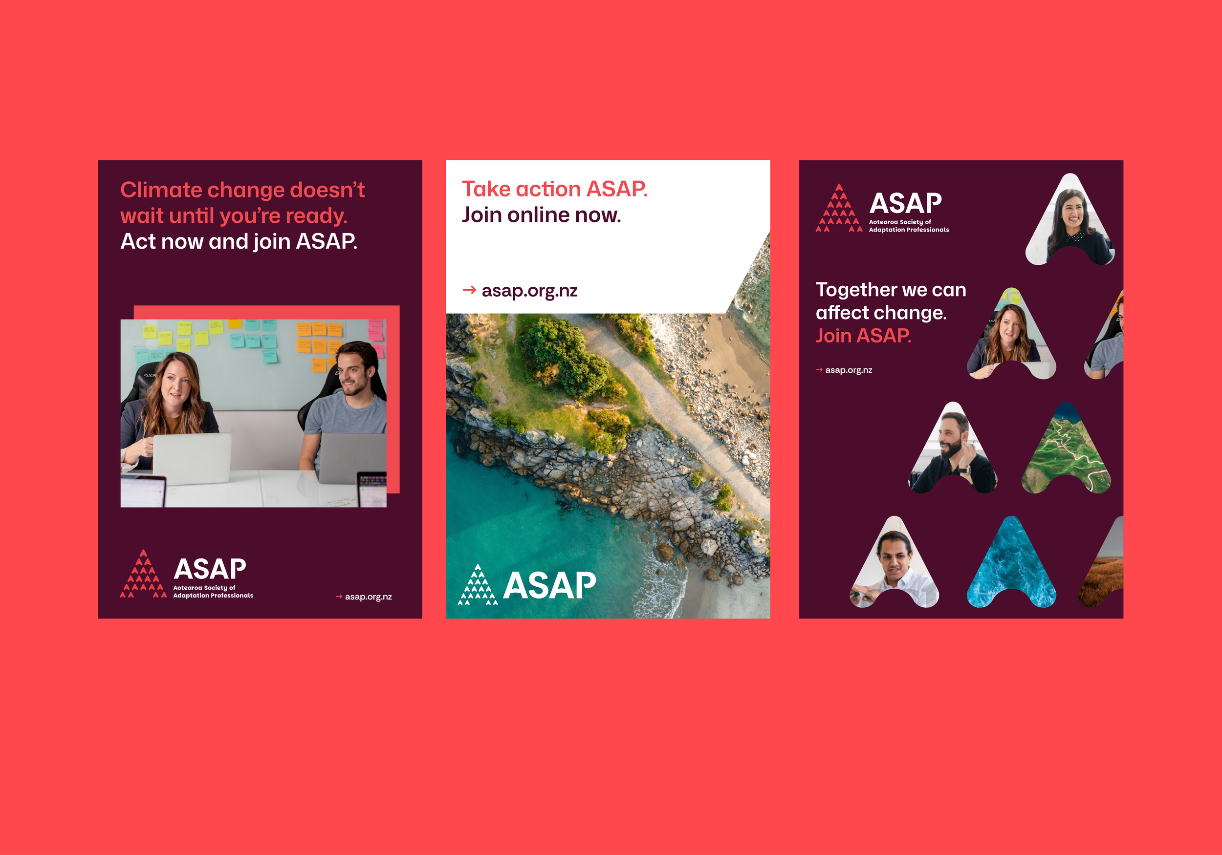
The brand identity visualises ASAP’s supportive, dynamic and collaborative values.
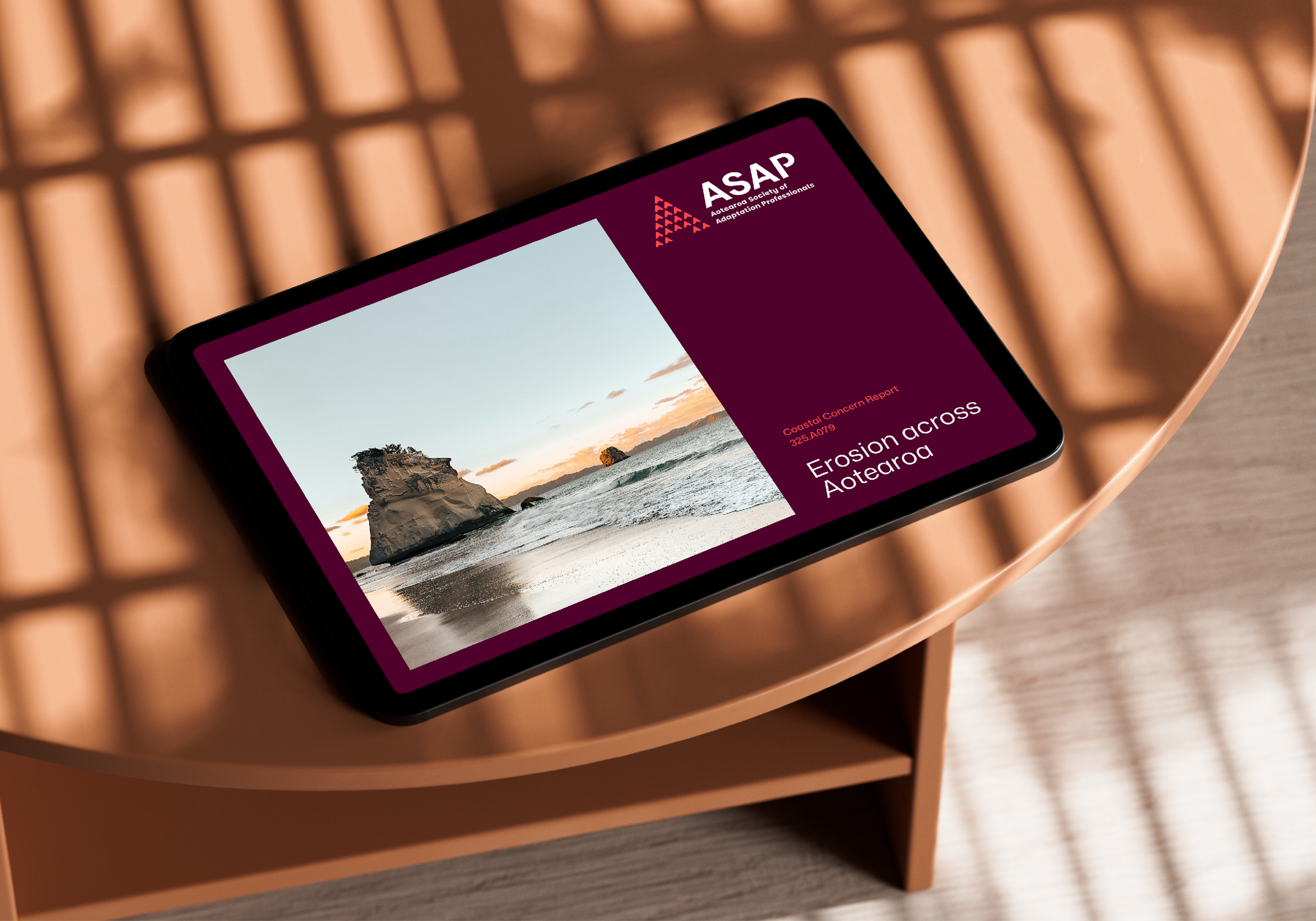
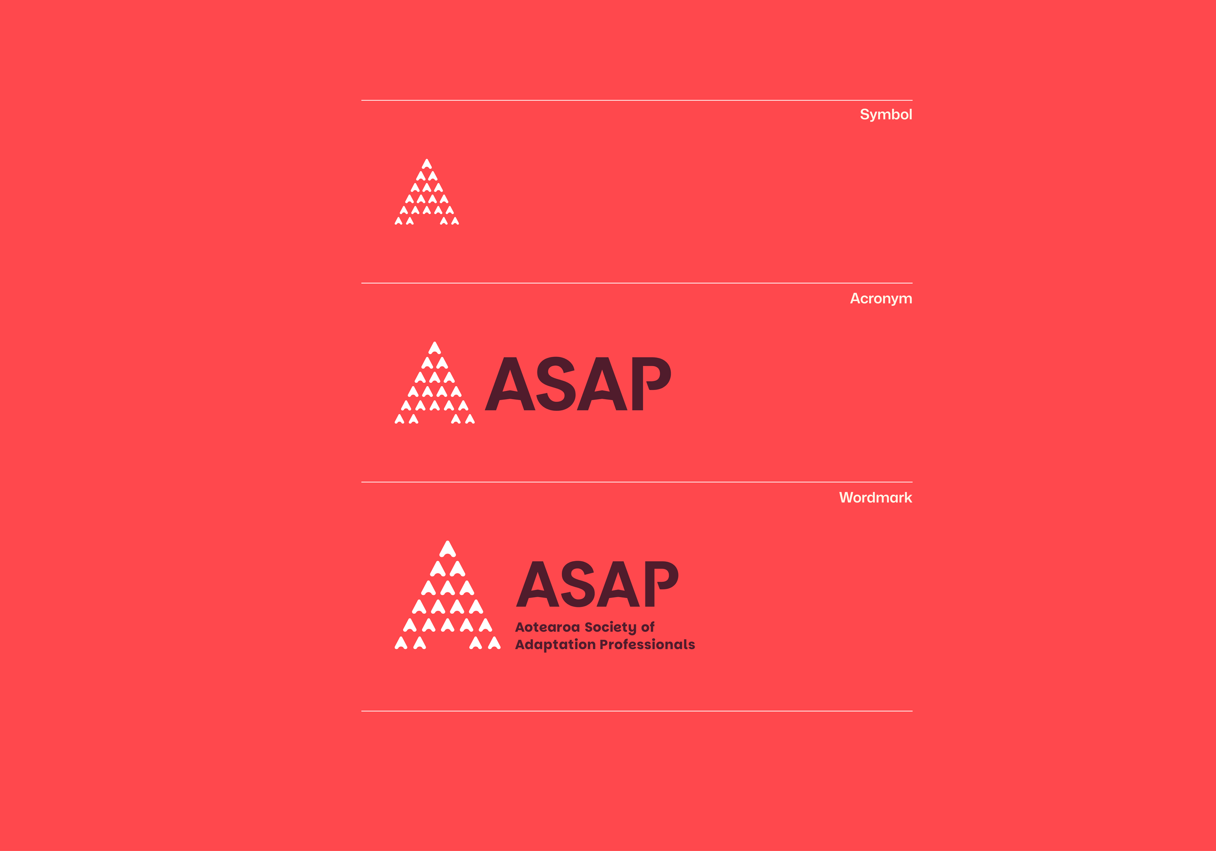
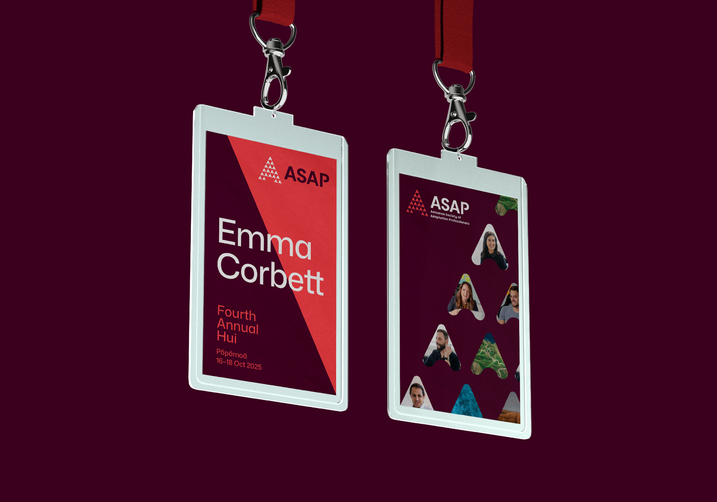
The collective of upward pointing arrows represent members working together, achieving meaningful change.
The uniting arrows create an abstract letter A, which becomes clear identifier for Adaptation in Aotearoa.
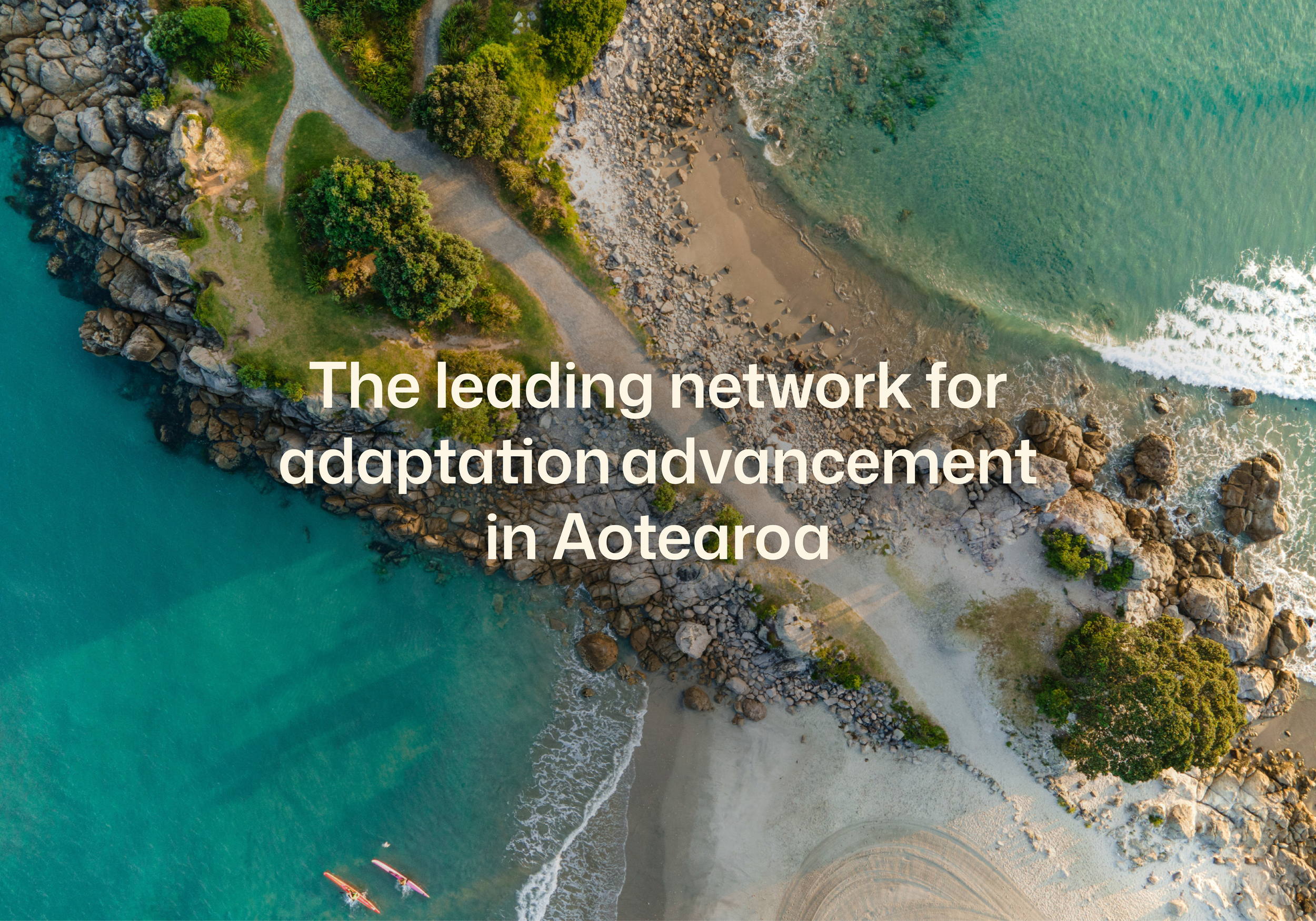
A brand to protect the land
ASAP was launched as an enduring legacy of UN Adaptation Futures Conference in Aotearoa New Zealand in 2025.
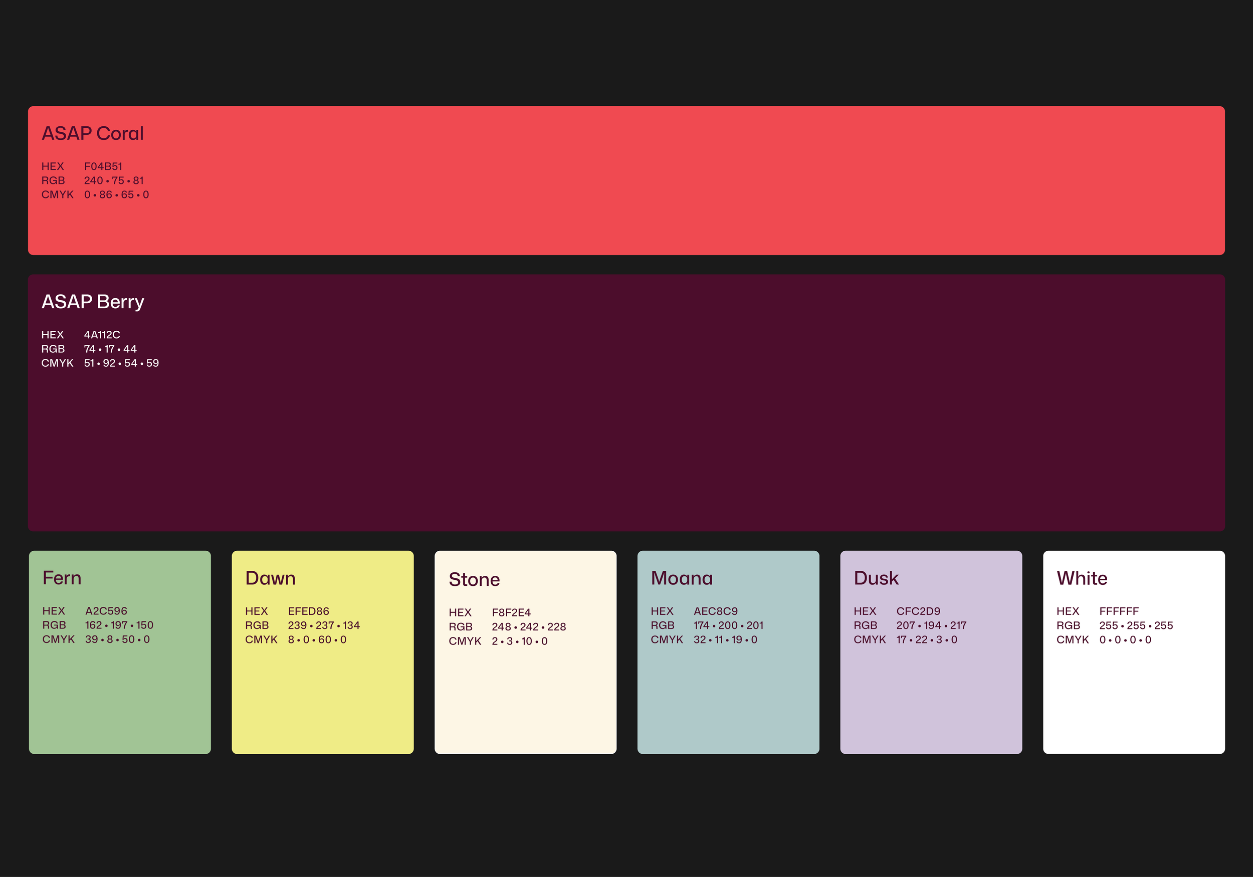
A dynamic palette
The brand identity purposefully harnesses the power of a punchy colour palette. Most environmental organisation follow a palette of green and blue, but Genre identified an opportunity to design a brand system that would make ASAP standout, rather than blend in.
Set apart in a sea of green and blue
A vibrant colour palette was designed to communicate the urgency of the work, and to create genuine stand out in our sector.
For novel ideas, start here
Are you interested in crafting a new brand identity? We can help, and would love to hear from you.